Debt Dashboard Revamp
Client: Gradwise Fintech
Type: Loan Servicing Platform
Role: UX/UI Designer
Platform: Web Dashboard
Team:
UX/UI Designer (Solo)
Product Manager (acted as stakeholder)
Frontend Developer (Handoff constraints)
Usability Reviewer (For external feedback and peer critique)
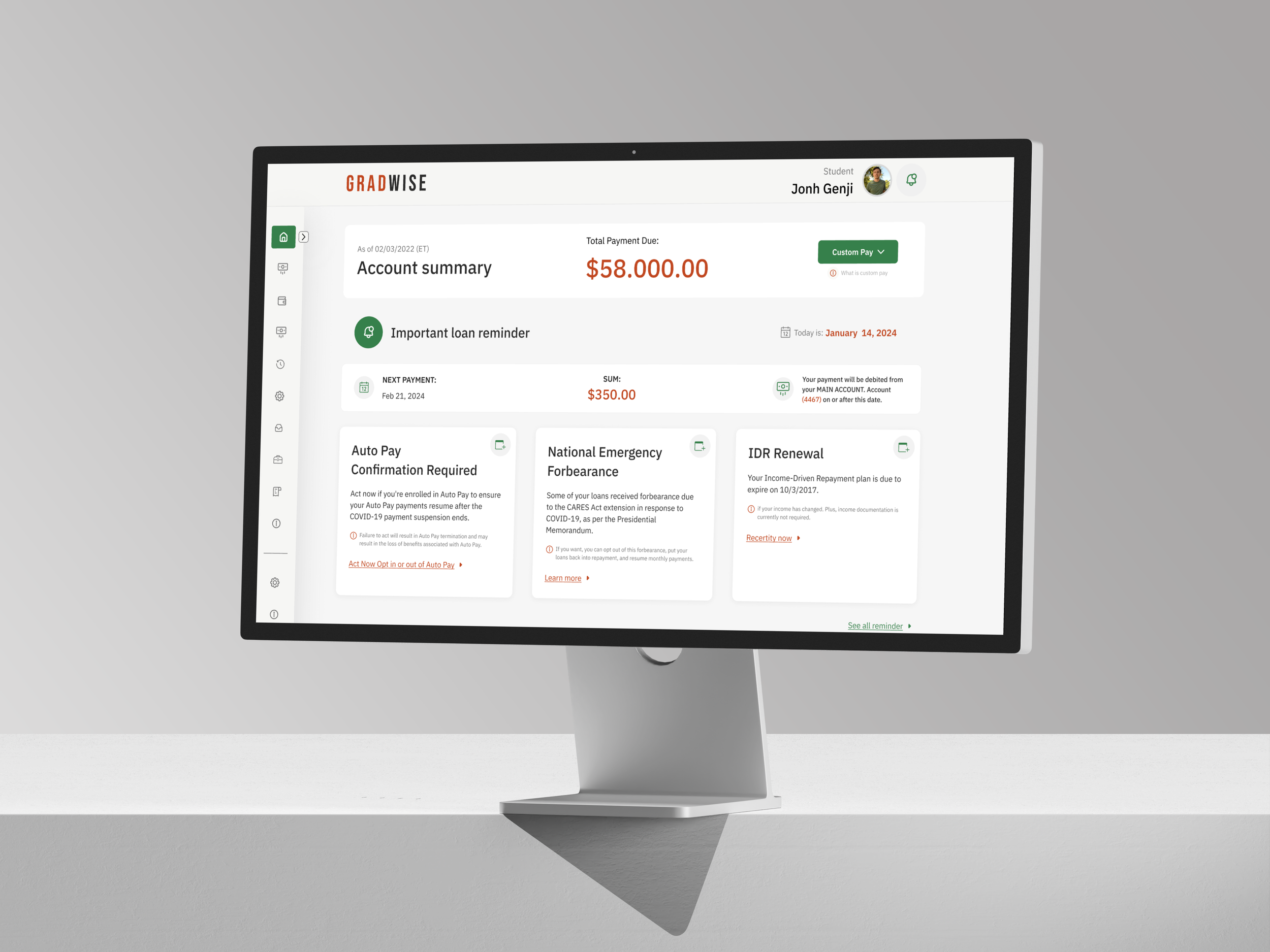
A dashboard built around decisions, not just data
Most loan dashboards are built for compliance, not clarity. Gradwise approached this redesign with a simple ask: keep all functionality—but make it easier to use, easier to scan, and easier to trust.
The existing UI was technically complete, but functionally overwhelming. Long text blocks, unclear hierarchies, and buried actions left users (already stressed) confused about what to do next. Our job was to clean it up—without removing anything essential.
Key challenges we tackled:
📉 Cognitive overload — Users were hit with too much information, too soon. No clear priority or scannability.
🧭 Poor navigation flow — Sidebar lacked structure and made it hard to quickly access critical tasks like payments or help.
🧾 Unreadable loan data — Tables were hard to parse, and critical payment details blended into the background.
🧠 No visual hierarchy — Alerts, reminders, and primary actions shared the same visual weight.
💡 Outdated UI pattern — The existing layout lacked modern UX conventions (no tabs, no cards, no responsive logic).

The procces
Discover → Research → Define → Design → Deliver
🧭 1. Interface Audit
I began by mapping out the hierarchy, structure, and functional groupings of the original interface. Several UX gaps stood out immediately: lack of visual grouping, competing alert styles, and too many text blocks presented with equal weight.
→ Output: Annotated screen breakdown with usability pain points
📐🎨 4. UI System & Components
I created a flexible card-based system with modular blocks for all major content types. Used color intentionally (red = urgent, green = resolved) and adjusted type scales for clarity. Tabs were introduced to consolidate sections without creating scroll fatigue.
→ Output: Figma component system (Auto Layout + Variants + Styles)

📐 2. Information Architecture
I restructured the layout to separate high-attention content (e.g. payment due, next payment, alerts) from low-attention data (historical records, disclaimers). Key areas like reminders, loan lists, and repayment status were grouped into dedicated sections with clearer logic.
→ Output: Wireframe sketches + reorganized content flow
🧪 5. Two Visual Directions
We presented two design concepts:
Version 1.0 was closer to the original in layout, but with cleaner visual styling. Version 1.1 reimagined the UI using cards, tabs, and more whitespace to reduce stress.
→ Final choice: Version 1.1, selected for its clarity, lightness, and visual rhythm
🧑💬 3. User Interviews
To validate UX pain points and understand real borrower behavior, I conducted a set of user interviews with peers who currently or previously managed student loans. The focus was on understanding how they interpret loan data, what triggers stress, and what they actually look for when logging in.
→ Output: Synthesized insights + prioritized usability themes
🛠 6. Handoff-Ready File
Final designs were organized with scalable Figma practices: separated pages for flows, consistent naming, nested components, and mobile responsiveness considerations.
→ Output: Clean Figma file with components and visual documentation
Research & Discovery
Understanding user stress, data overwhelm, and dashboard friction before designing.
We started with a quick discovery sprint—reviewing the original UI, aligning with the brief, and simulating a real stakeholder review. I also ran informal interviews with peers who manage or have managed student loans.
The goal: identify what information users actually care about, where the confusion starts, and what UI elements slow them down.
Then we dove into
→ Conducting 1:1 user interviews with borrowers to understand expectations, stress points, and top-priority tasks when logging in
→ Auditing the original dashboard layout to identify UX bottlenecks, redundant content, and mismatched visual hierarchy
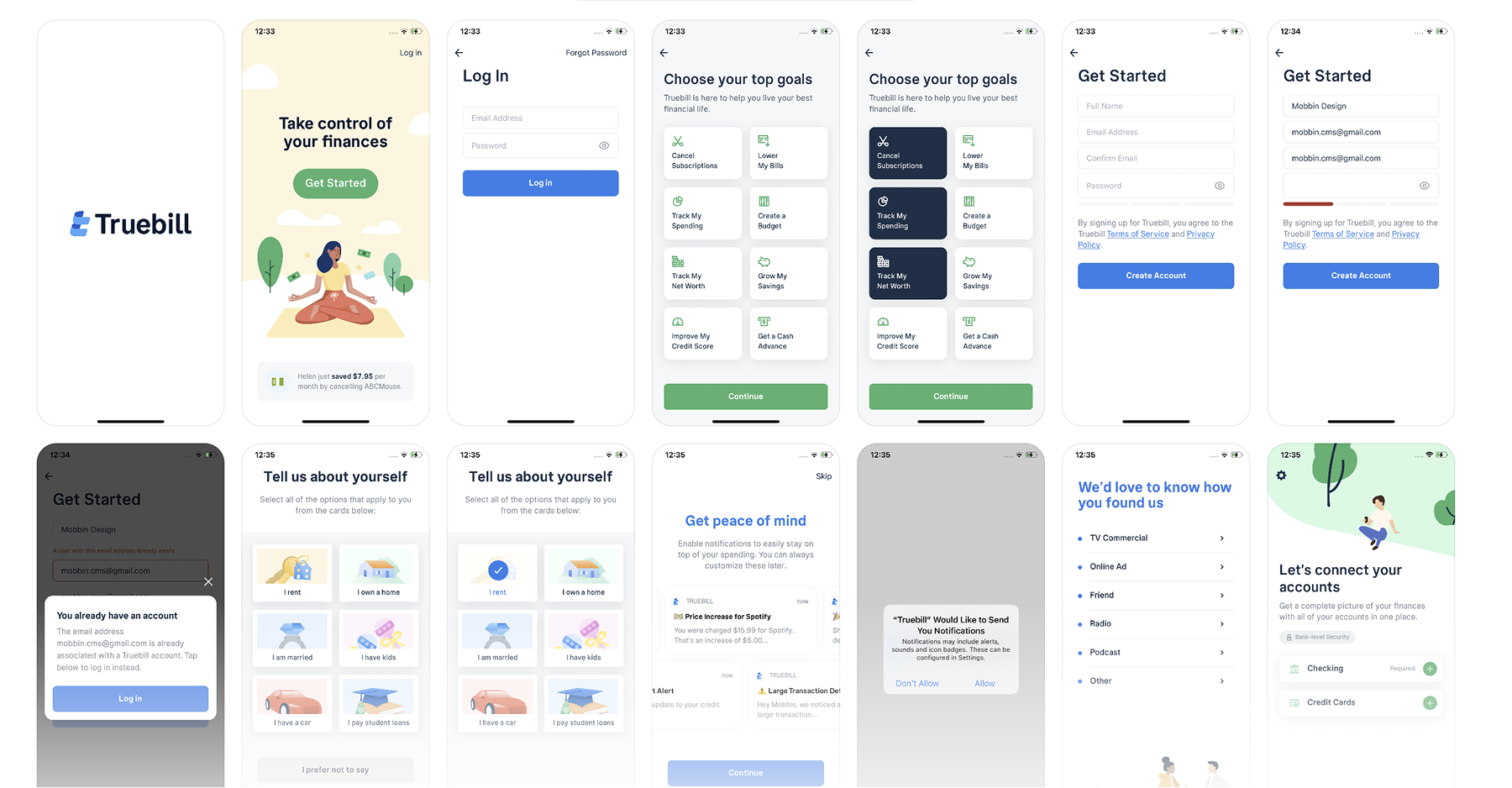
→ Reviewing peer platforms like Truebill and Revolut to benchmark clarity in financial dashboards and explore layout inspiration from the client.
→ Mapping primary tasks (check balance, make a payment, manage auto-pay) and identifying which ones were buried or unclear
→ Testing early hypotheses through feedback loops with peers to refine what “usable” really meant in the context of loans
User Interview Deep Dive
Asking better questions to design a better experience.
I spoke with 3 individuals managing student loans to dig deeper into how they interact with repayment dashboards. Rather than focusing on surface-level usability, I structured the conversations around intent, frustration, and decision-making behaviors.
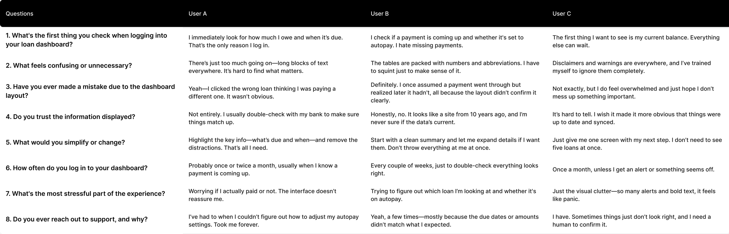
🎯 Patterns That Emerged
Users scan, not read — They’re task-focused, not exploratory. The UI should support goal completion, not passive browsing.
Overload kills trust — When everything looks “important,” nothing feels credible.
Micro-interactions matter — Even basic hover states or payment confirmations can reduce uncertainty.
Hierarchy drives action — Users make decisions based on visual weight. Payment amount > alerts > history.
🔄 How This Impacted the Design
Created a clean header block with total due + next payment as the primary focus
Grouped secondary info into collapsible cards to reduce noise
Used calm color palette and spacing to reduce overwhelm
Introduced tabs to keep views focused on one type of content at a time
Added microcopy near payment buttons to boost confidence (e.g. “You won’t be charged until…”)
The interviews gave us more than quotes — they shaped what mattered. From layout to copy to visual weight, every change traced back to real borrower behavior.
UX Audit
Stress tested the original dashboard to surface usability blockers.
Before touching Figma, I broke down the existing dashboard page section by section—mapping out visual hierarchy, content weight, and expected user flow. The goal was to understand where the current layout failed to support fast, confident decision-making.

What I looked for:
→ Visual hierarchy: Were primary actions (like payment due) being visually prioritized?
→ Content grouping: Did related information sit together logically, or was it scattered?
→ Redundancy: Were alerts, disclaimers, and balances repeated in unnecessary ways?
→ Scannability: Could users quickly spot next steps without reading full paragraphs?
→ UI friction: Were key components too text-heavy, or using patterns that increased effort?
No clear entry point
Important payment info buried under alerts
Multiple messages styled the same = alert fatigue
Visually flat table — hard to scan or compare
Primary actions don’t stand out
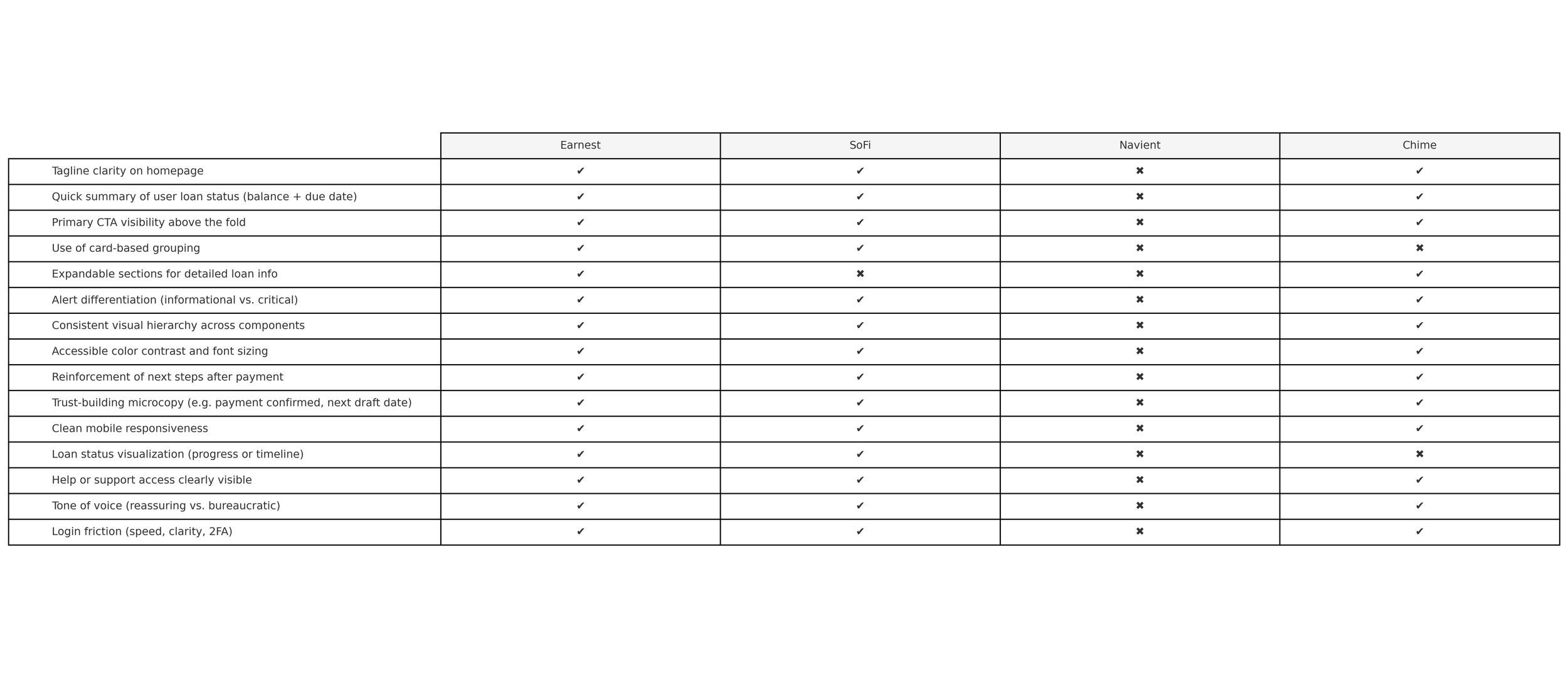
Peer Analysis
Looking beyond visual inspiration to understand structure, flow, and task clarity.

Platforms reviewed:

→ SoFi – Strong at framing user action with a clean hierarchy: payment > goal > history. Also good use of card-based content grouping.
→ Earnest – A modern student loan refinance platform with clear repayment overviews, subtle alert logic, and progressive disclosure for loan details.
→ Navient – A legacy student loan servicer often criticized by users—useful for identifying what to avoid (overloaded tables, jargon-heavy alerts).

→ Chime – While not loan-specific, Chime’s approach to simplifying financial info helped inform how to visually calm the experience.
What I focused on:
→ How platforms handle visual weight and color signaling
→ Whether they separate actionable info vs. archival data
→ How clearly they surface next steps (e.g. “Pay Now,” “View Details”)
→ Use of microinteractions or nudges to guide behavior without clutter
What Stood Out
Our deep-dive into peer platforms and user interviews revealed key areas where Gradwise could evolve — and where modern fintech tools already lead the way.
🧠 Cognitive Load & Prioritization
The dashboard placed all content—alerts, loan details, payment options—on equal visual footing.
Important actions were buried, while less urgent disclaimers were emphasized.
There was no clear “start here.””
🧾 Content Overload
User interviews confirmed what the audit hinted at: too much text, unclear structure, and duplicate info blocks.
Tables lacked hierarchy. Alerts repeated themselves. Loan data was comprehensive—but overwhelming.
🤝 Trust & Task Confidence
Users expressed doubt in the accuracy and completeness of what they saw.
Lack of feedback (e.g. confirmation states, payment history clarity) reduced confidence.
Small UX details were missing that could build reassurance.
🎯 Lack of Action Clarity
Despite being a tool meant for repayment management, the dashboard didn’t highlight what users should do next.
There was no visual anchor for “make a payment,” “adjust autopay,” or even “you’re all set.”
Where we saw opportunity
After auditing the original dashboard and synthesizing findings from user interviews, it became clear: his wasn’t a visual design issue — it was an experience design problem.
Key actions weren’t prioritized / Information was dense but disorganized.
The interface made it harder, not easier, for users to manage time-sensitive financial decisions.
The redesign was an opportunity to address structural flaws — from layout and hierarchy to interaction patterns and content logic — and build a system that better supports task completion, comprehension, and long-term scalability.
Here’s what we focused on
Restructuring the core dashboard hierarchy
So users could immediately see their payment status, understand what actions are needed, and reduce unnecessary scanning.
Grouping content by user intent
Breaking out sections like loan details, payment options, and past transactions to match how users actually think and behave — not how backend systems are structured.
Streamlining interaction design
Fewer buttons, clearer paths. Key actions like “Make a Payment” or “Set Up AutoPay” were elevated and visually reinforced.
Laying groundwork for future scalability
Modular UI patterns and layout logic that can support feature growth (e.g. repayment simulator, loan comparisons) without redesigning the whole system.
Task Mapping: What Users Came to Do
💰 Check current balance
We broke down the core user goals into three primary tasks:
📅 Make a payment /Manage or enroll in auto-pay
🔁 Manage or enroll in auto-pay
→ While all three were technically present on the original dashboard, none were clearly prioritized in the layout.
→ The most important tasks were often buried beneath alerts, disclaimers, or secondary copy.
→ This insight directly informed our information hierarchy — making critical actions more visible, predictable, and frictionless.
Feature Prioritization Framework
To ensure the redesign met user needs, stakeholder priorities, and technical feasibility, we mapped features into Now, Next, and Later:
Now
The must-haves — high-impact and critical for launch
Streamlined loan summary layout
Clear payment amount + due date
Direct “Make a Payment” CTA
Visual status on Auto-Pay enrollment
Grouped active vs. zero-balance loans
Next
Post-launch feature iterations
Payment history filtering
Add early payment strategy guidance
Smarter auto-pay nudges
Improve accessibility of table components
Later
Scale + longer-term
Personalized insights (e.g. “You’re ahead”)
Integrated loan calculators / simulators
Exportable statements and tax tools
Setting the Visual Direction
To support core loan tasks and improve usability, we needed a visual system that prioritized clarity, structure, and scalability.
The client shared a few visual references early on, helping define guardrails around tone — clean, minimal, and user-friendly. We supplemented those with internal benchmarks from fintech dashboards, focusing on how layout and typography impact comprehension and reduce cognitive load.


UX + Product Priorities:
Neutral, accessible palette that supports focus and avoids UI noise
Hierarchical typography that improves scannability and helps distinguish tasks from context
Flexible layout system adaptable to future needs — from payment views to data tables
Component-driven approach to allow for easy iteration and CMS-level control
Cleint’s references:

References that we provided:
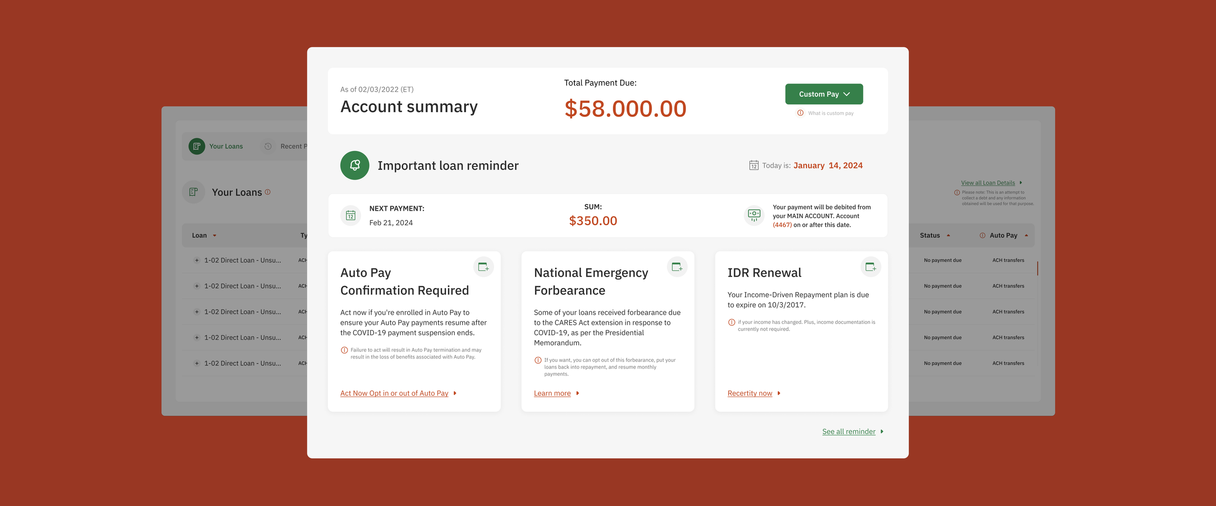
A dashboard designed for real financial decisions
One place to manage it all:
→ Contextualize alerts — Dynamic reminders based on user status and account data
→ Clarify next steps — Bite-sized summaries with immediate, relevant actions
→ Support trust and transparency — Messaging aligned with user mindset, not legalese
We built it to do three things well:
→ Surface the essentials first — Payment due, deadlines, and balance are front and center
→ Nudge toward action — Clear CTAs and alerts tailored to repayment needs
→ Lower the cognitive load — Prioritized content and stripped-down layout to reduce friction
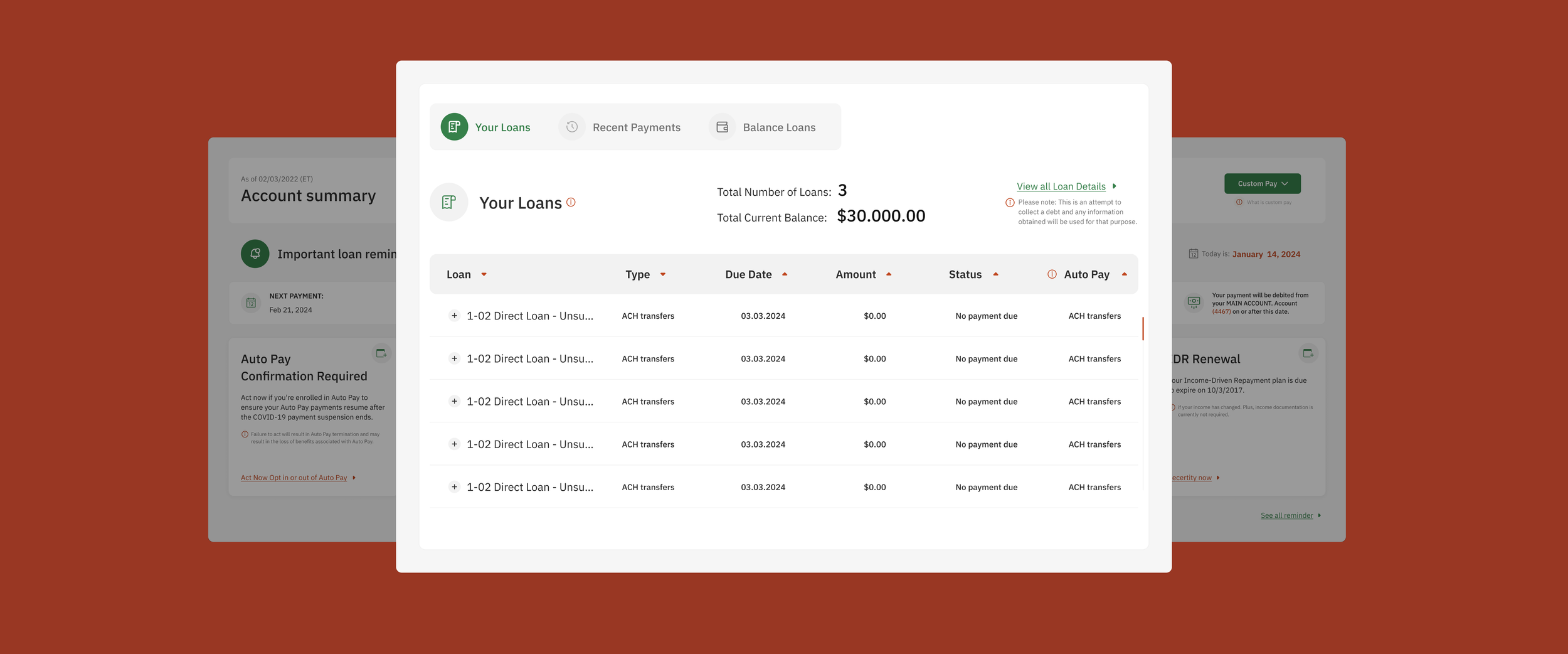
One place to manage it all
We built it to do three things well:
→ Structure key flows into tabs — Your Loans, Recent Payments, and Balance Loans
→ Make scanning intuitive — Simple tables, inline statuses, and visual sorting
→ Empower deeper control — Loan Simulator offered without interrupting core tasks
Hands On
Testing What “Usable” Really Means
To validate the experience, we tested the final dashboard with peers and designers — focusing on how clearly it communicates core tasks like checking balance, making payments, and enrolling in auto-pay. We wanted to uncover friction, confusion, or hesitation in real-time.
🧠 What We Tested
Can users find their current balance immediately?
Is it clear where and how to make a payment?
Do users understand auto-pay status and how to manage it?
How intuitive is the loan table for scanning info?
🔍 Key Insights (right or second column):
Positive: Users quickly recognized key tasks and felt the layout was “calm” and “organized”
Improvement: Some users missed secondary reminders without icon cues
CTA clarity: A few asked for more feedback after clicking buttons (confirmation messages)
Visual grouping: Tabs helped separate flows, but some users weren’t sure which tab was active
Based on the feedback, we noted UI adjustments for clarity and built a short checklist of future microinteractions to improve feedback and flow.
Key Learnings
🧠 What We Took Away
This wasn’t just about visual improvement — it was an opportunity to rethink how financial tools communicate with real people managing debt. The challenge wasn’t styling; it was prioritization, decision support, and long-term usability.
⚠️ Clutter hides urgency
Important data (like due dates and totals) was visually buried. We restructured the hierarchy so users can assess and act quickly — even under stress.
🔁 One screen, multiple mental models
Even within one dashboard, users have different priorities — some want to pay now, others want to track status, some just want to check progress. Our redesign had to accommodate all three without creating friction.
👀 Visual simplicity builds trust
Users told us they felt unsure whether info was accurate. By simplifying layout, clarifying copy, and removing noise, we reduced uncertainty and increased user confidence.
Impact & Insights
While this wasn’t a live product launch, the design direction was built for scale — and tested to validate key usability goals. Here’s what surfaced:
👁️ Users scanned with more confidence
Design decisions like bolding payment info, using visual tab separation, and decluttering alert content made it easier to scan and decide. Fewer misclicks and questions in testing sessions.
🧠 Cognitive load went down
Quotes like “It feels like I actually know what I’m doing” came up consistently. This aligned with our goal to reduce overwhelm by prioritizing clarity over density.
✅ Task flow completion improved
Test users were able to complete tasks like checking payment status and toggling Auto-Pay without prompts — a marked improvement over the original screen, where users hesitated or asked what “Apply” meant.
Dashboard Experience
A focused, task-driven dashboard designed for clarity, trust, and long-term scalability.